- Fintech
- Mobile
Simplifying wealth management through one unified financial experience
A personal wealth management app approachable for first-timers, with the depth experienced investors expect, delivered on a tight timeline.
- My role
- Product Designer
- Date
- December 2022 - May 2023
- Platform
- Mobile Application (iOS & Android)
- Tools
- Figma, FigJam, Miro, Notion
- Team
- Product Manager, Developers, Stakeholders, and me
Chapter 01
Introduction
The product
Worthsight is a personal wealth management app that pulls budgeting, spending insights, savings, investment tracking, and financial goals into one dashboard, instead of five different apps.
About the project
I led the end-to-end design on a tight timeline: research, personas, user flows, wireframes, high-fidelity UI, and the interactive prototype for handoff.
Chapter 02
Problem space
Problems to solve
Finances scattered across too many apps
Switching between apps for spending, investments, and savings makes one simple question hard to answer: how am I actually doing?
Investment tools assume expertise
Most platforms speak fluent finance. For everyone else, the jargon is a wall, not a window.
Budgeting apps ignore the future
Plenty of tools track last month. Very few help you plan where you are going.
Why solve these problems?
The anchoring insight came from empathy mapping: people do not want more financial information, they want more confidence in their decisions. A product delivering clarity, not just data, had a real gap to fill.
Goals
Company objective
Launch a wealth management app that everyday users can actually read, in time for a fixed release window
Project goals
- Bring multiple financial activities into one platform
- Make wealth management understandable without expertise
- Encourage better spending, budgeting, and investment habits
- Ship a polished product within a short timeline
Our users
Intentional beginners, like Mrs. Sarah
My persona Mrs. Sarah wants to manage wealth deliberately but finds existing tools overwhelming.
Experienced investors
They know their way around a portfolio. No hand-holding needed, but everything in one place with depth on demand.
Jobs To Be Done
See my whole financial picture at a glance
Assets, investments, savings, and goals on one dashboard.
Understand my spending habits
Insights over raw transaction lists.
Plan for goals with confidence
Clear progress indicators toward each financial goal.
Chapter 03
Solution space
Exploratory research
User interviews
Our hypothesis
- People want confidence in their financial decisions more than they want more data
Learnings
- Confidence, not more data, was the recurring theme
- Jargon and short-term tracking were the two biggest walls
Solutions
ProblemFinances scattered across too many apps
SolutionA unified dashboard with real-time updates across assets, investments, savings, and goals.
ProblemInvestment tools assume expertise
SolutionPlain language and goal-relevant information first; depth on demand for experts.
ProblemBudgeting apps ignore the future
SolutionGoal planning with progress indicators, plus visual insights that point out opportunities.
User flow
The key journeys
I mapped onboarding, budget creation, investment tracking, asset overview, and goal management as connected flows.
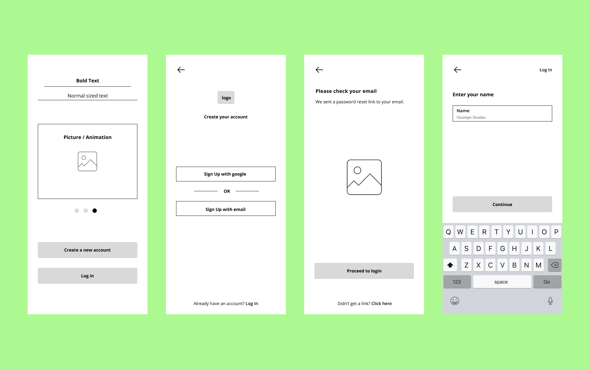
Low-fidelity exploration
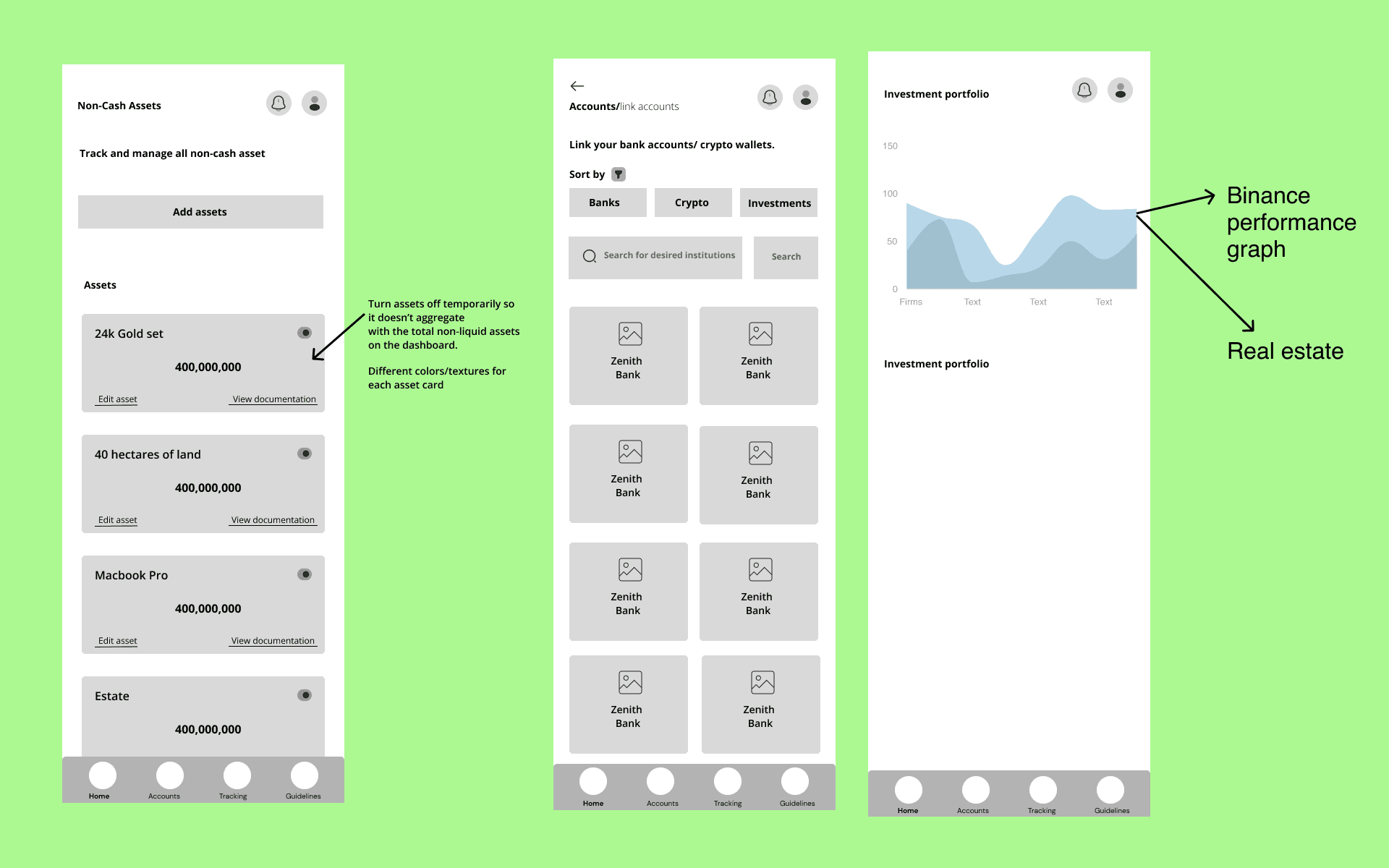
Rapid wireframes validated layouts and hierarchy before visual design, which mattered on this timeline.
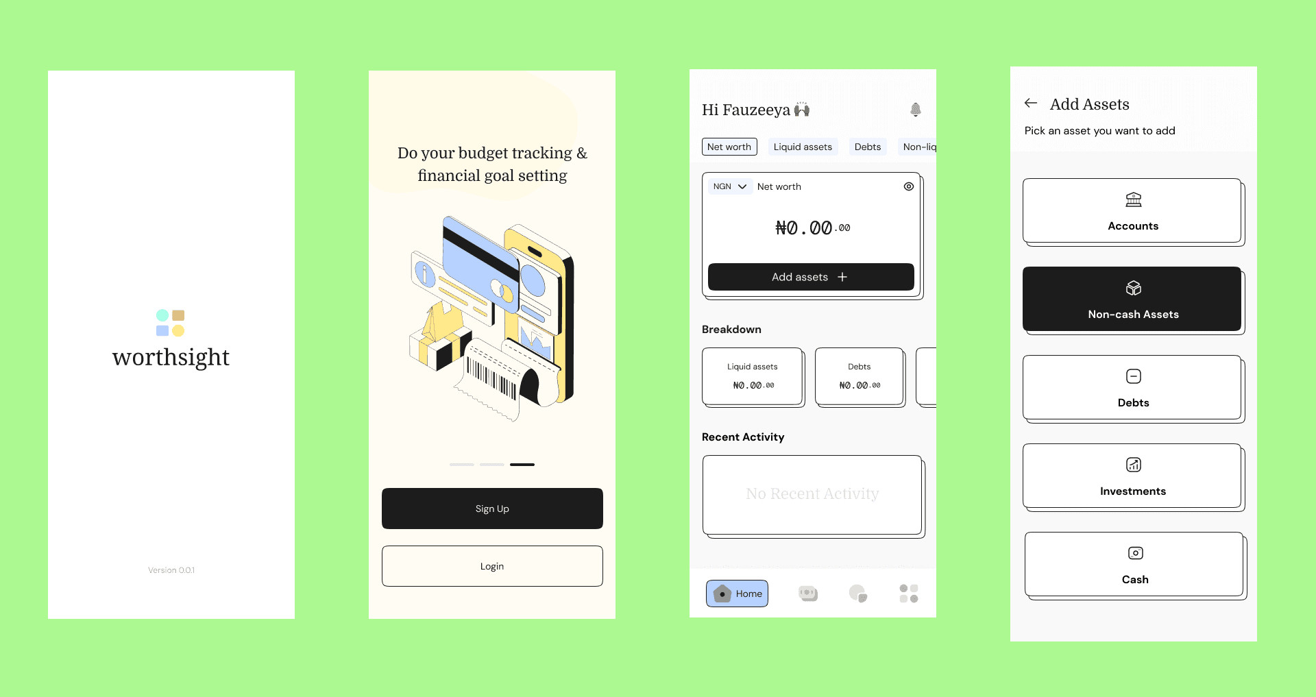
High-fidelity design
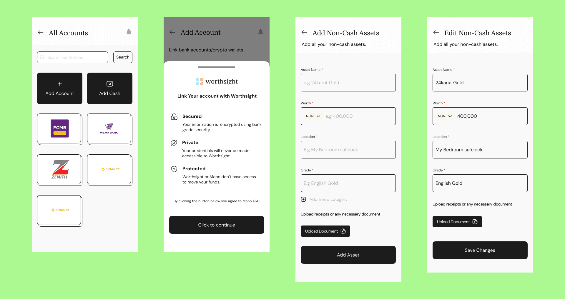
The final interface leans on clean layouts, generous spacing, clear typography, and dashboards you can read at a glance.
Prototype (recording)
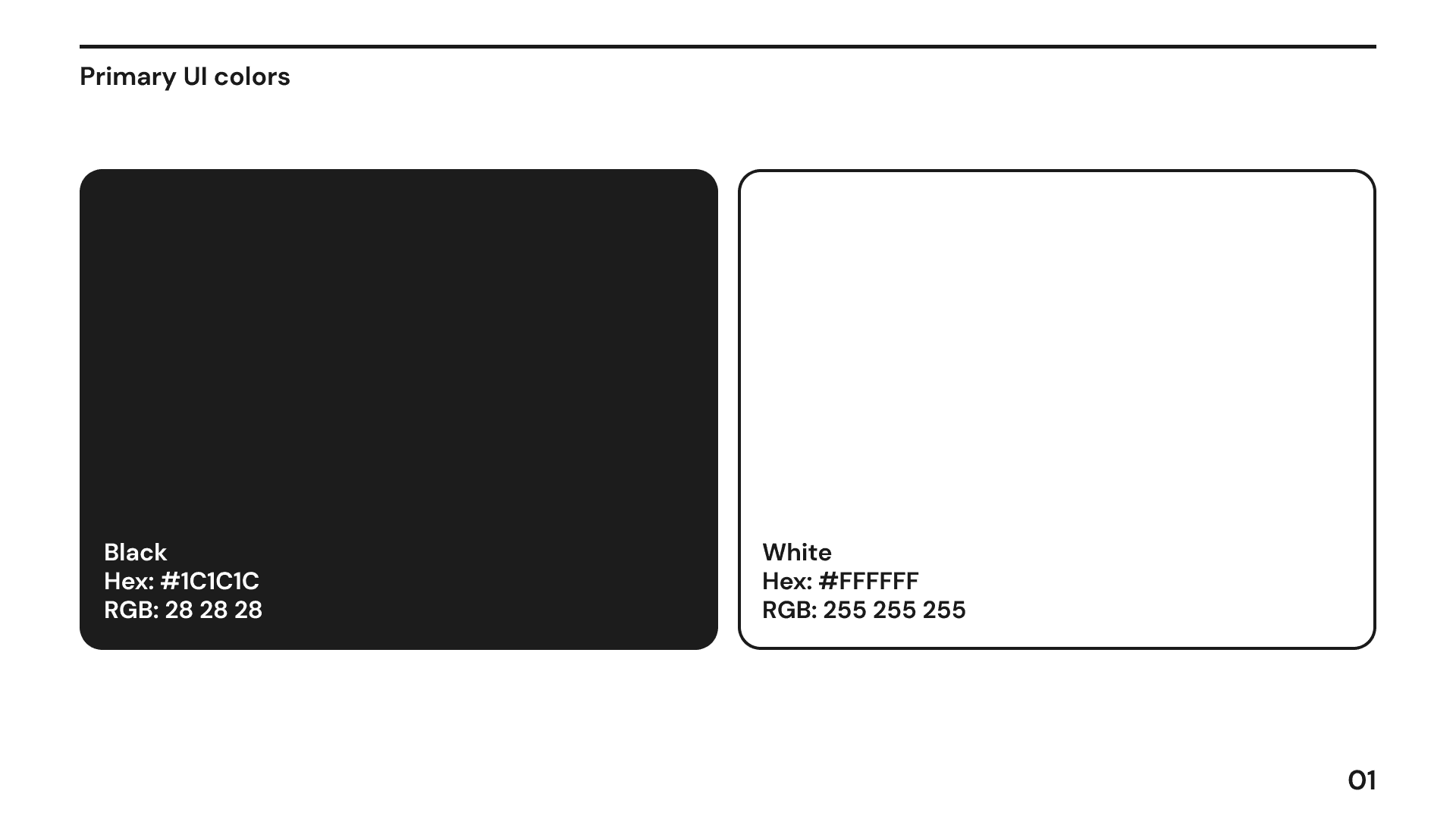
Design system
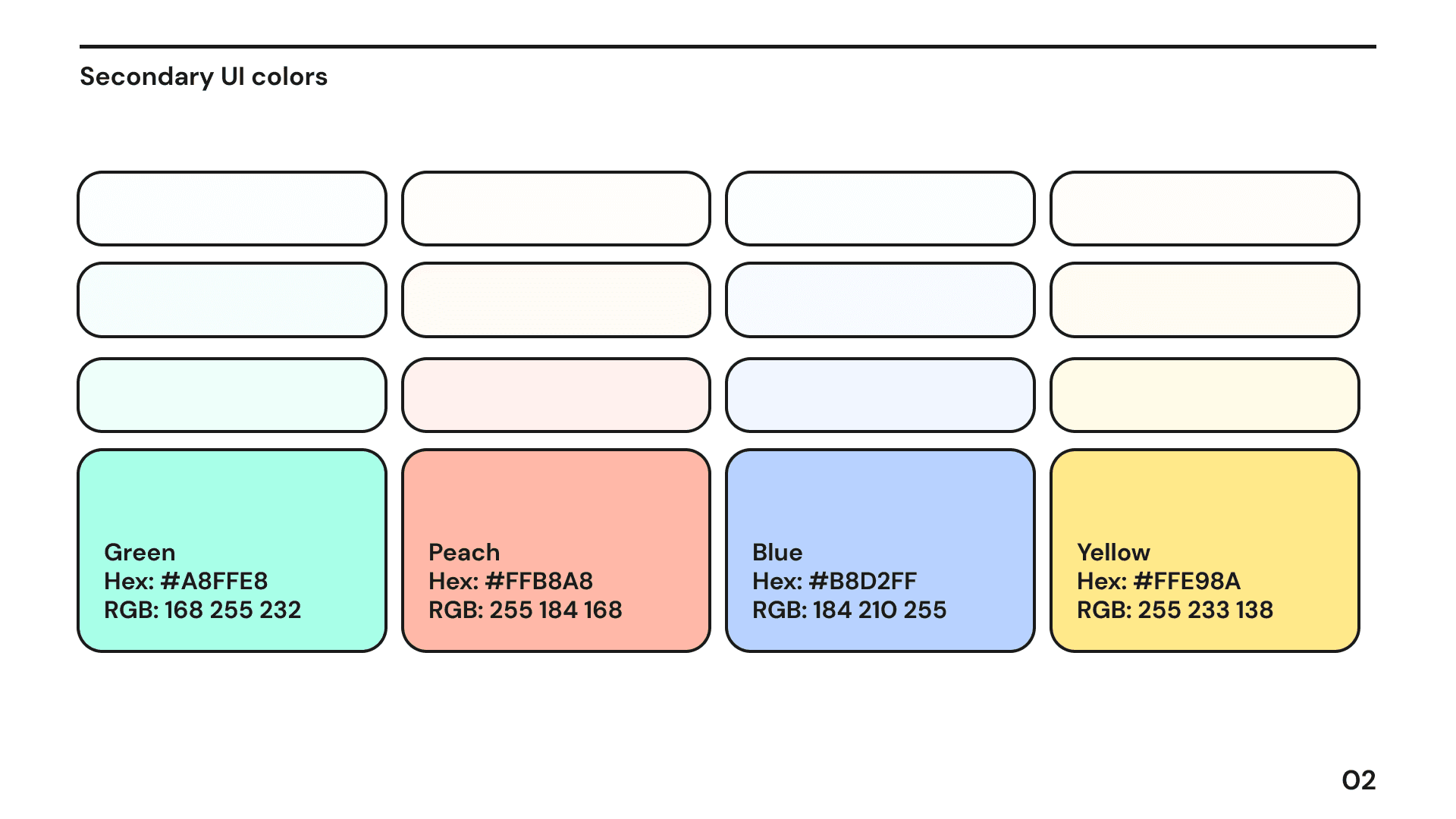
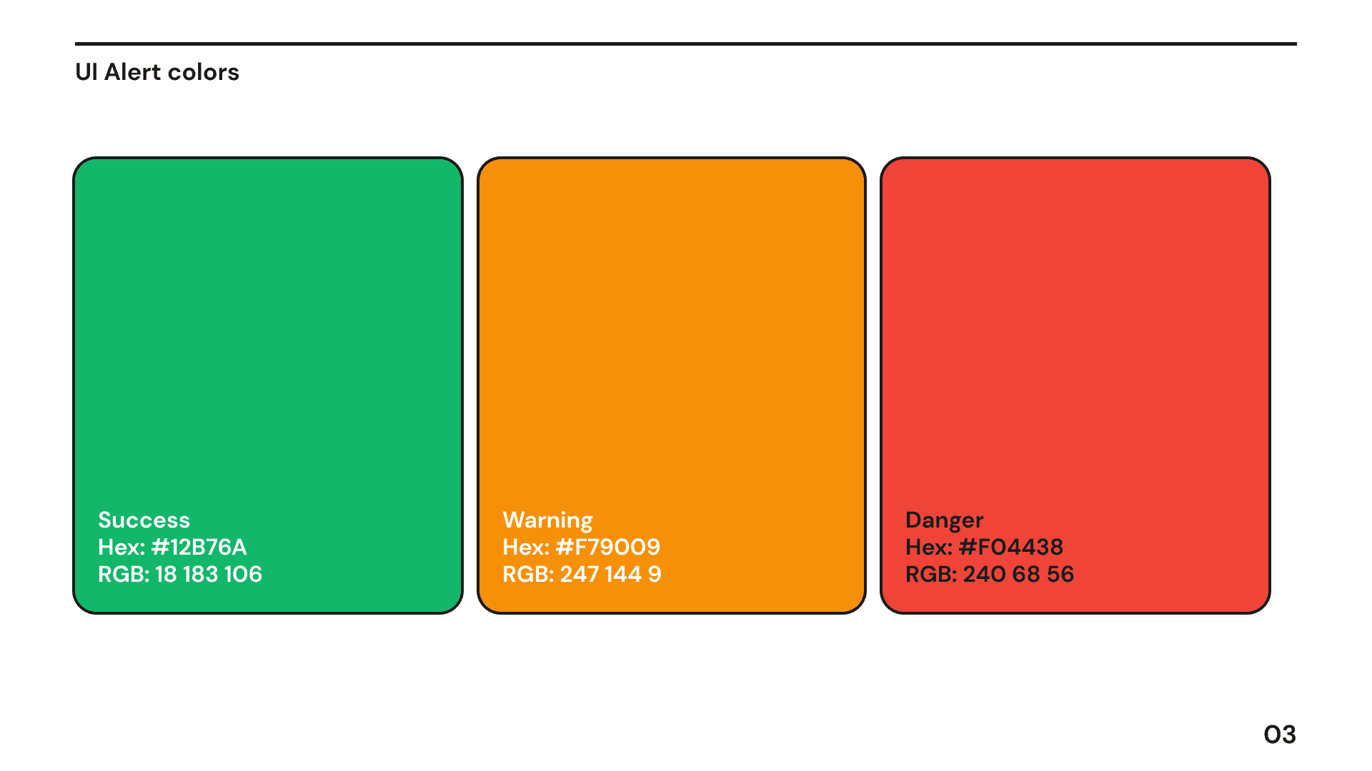
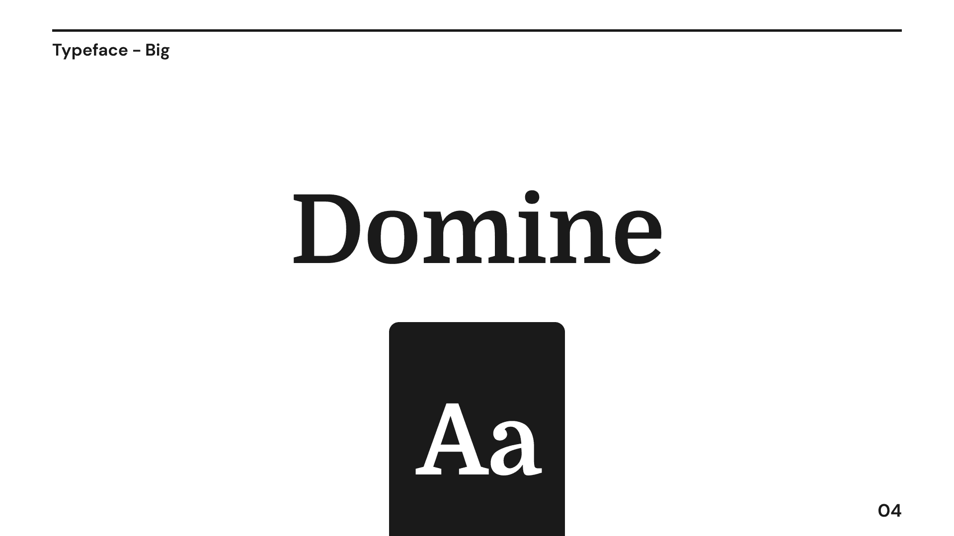
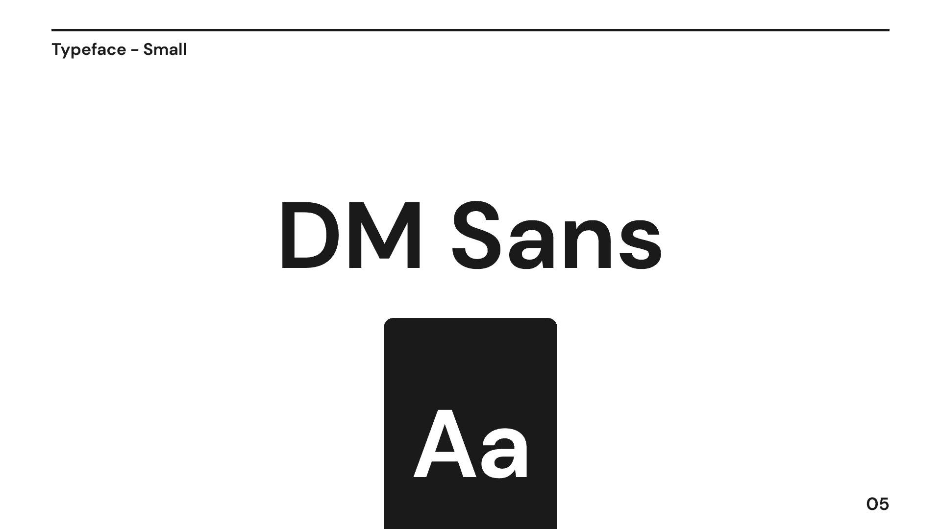
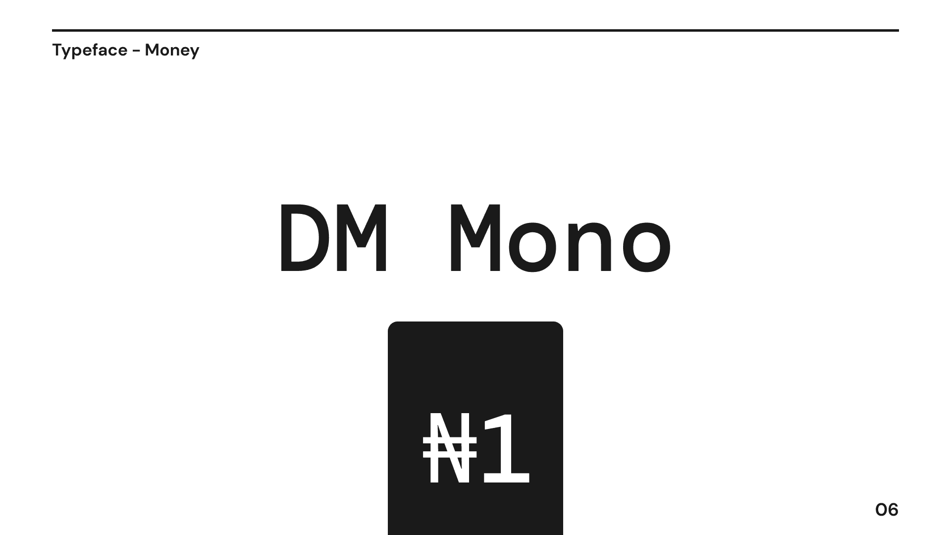
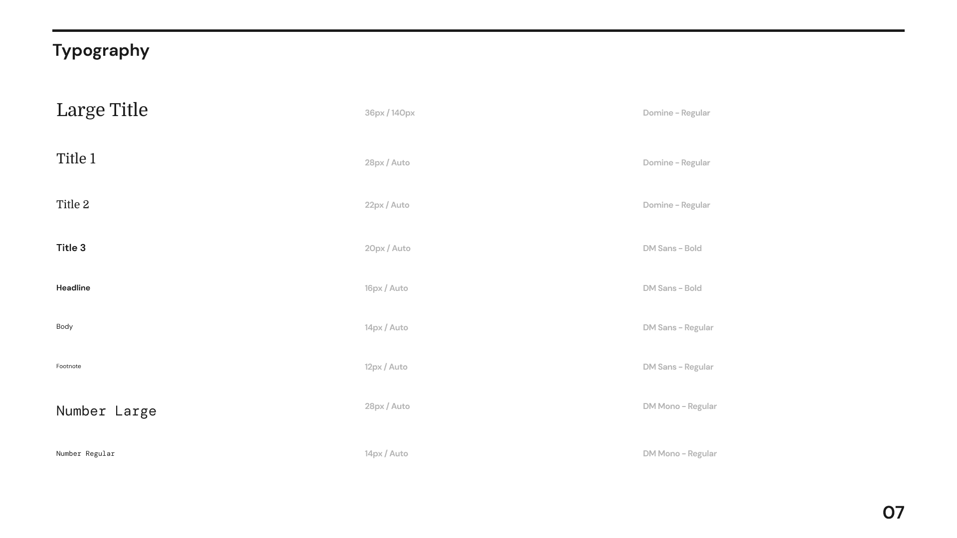
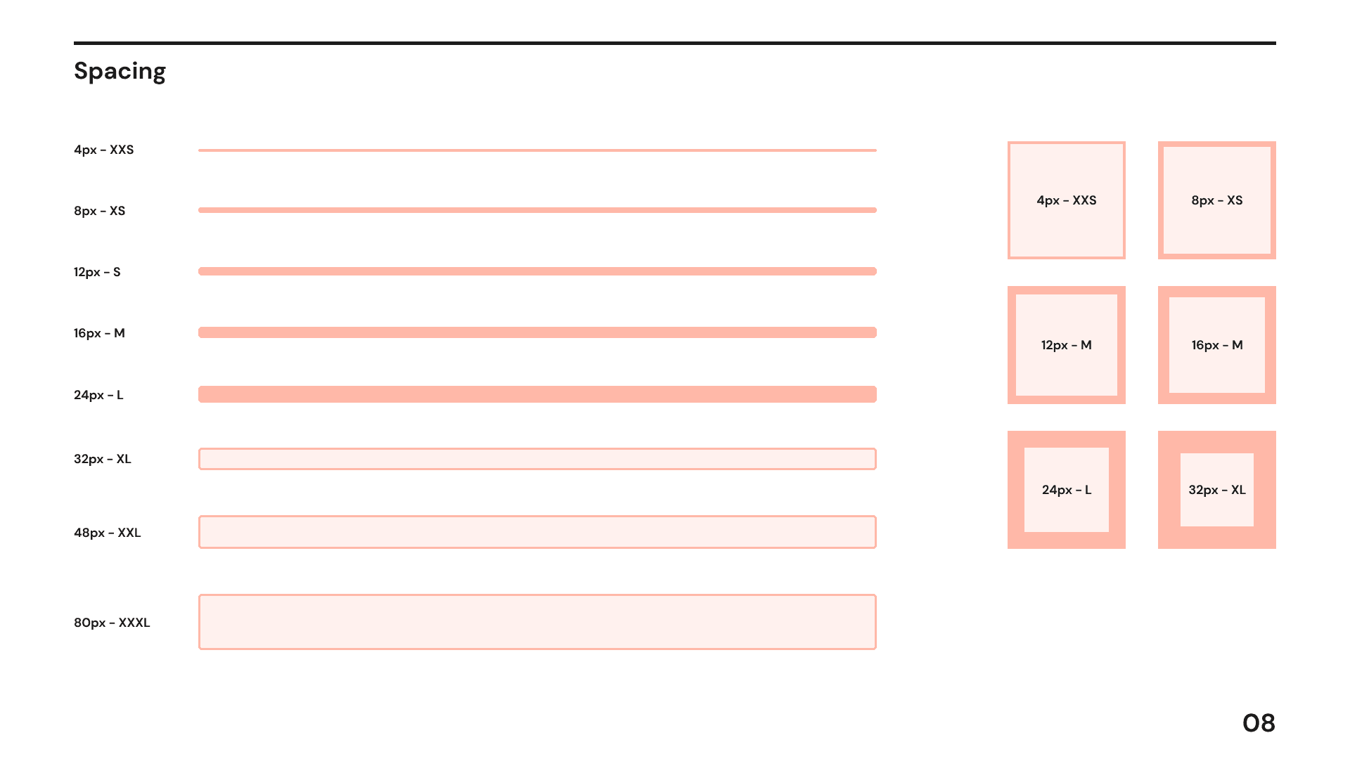
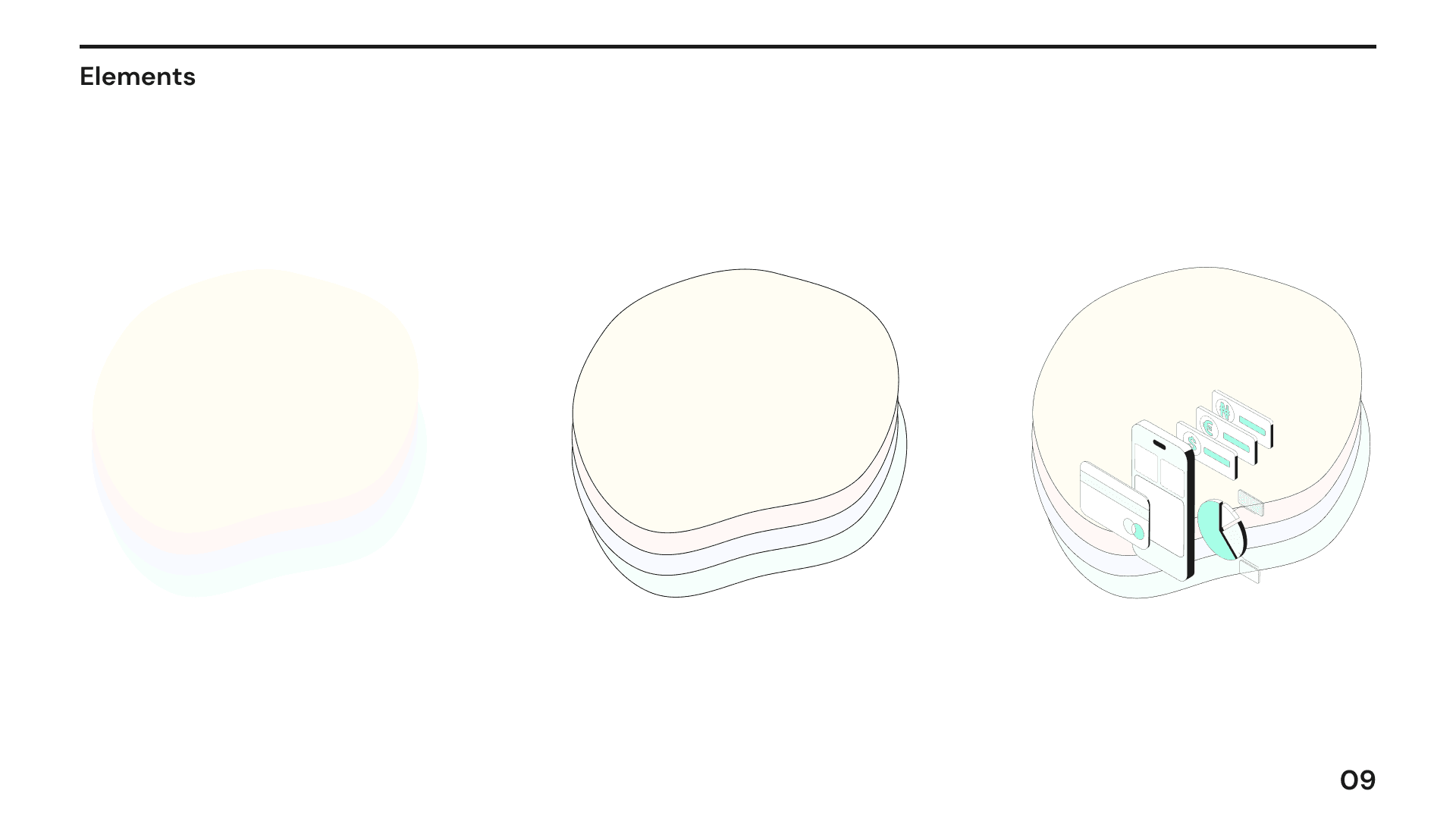
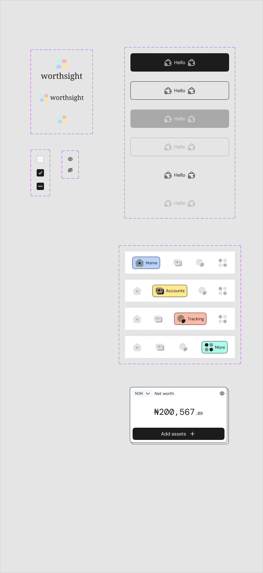
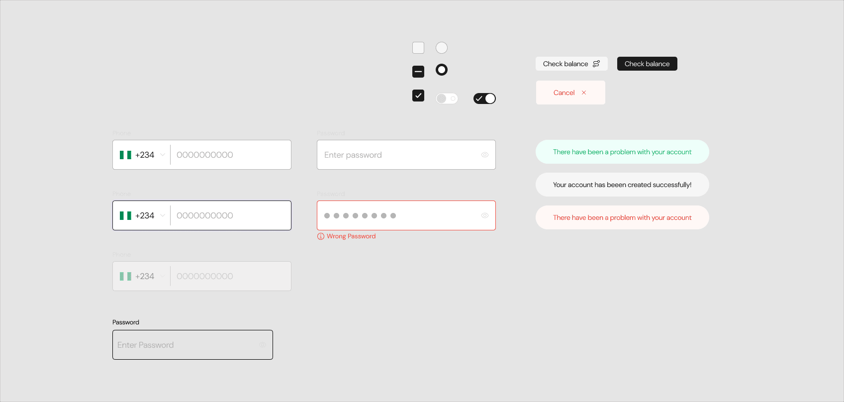
I built Worthsight's design system from the logomark up: primary, secondary, and alert colors, the type scale, spacing, and core components with their states.
Usability testing
I tested a clickable prototype with participants from both personas: intentional beginners and experienced investors.
Results
- Beginners tripped over jargon, so labels were rewritten in plain language with detail on tap
- The first dashboard showed everything at once, so it now leads with net worth and goals, depth on demand
- Goal progress became a glanceable indicator instead of a number
Measuring success
Was the project successful and why?
The project shipped on time and hit its goals
One dashboard for assets, clearer spending habits, investment monitoring, and confident planning, regardless of financial experience.
Future vision / next steps
- A Trusted Contact feature for emergency planning
- Automated coaching and personalized investment recommendations
- Goal-based saving automation and shared family finance
Chapter 04
Final designs
Previous case study
← Konvas AINext case study
AfroHealth →